You Won’t Be Able To Resist Buying These Products. Amazing Packaging!
When we visit a supermarket, sometimes we would just grab a product because of its packing. Isn’t it? At that time, it doesn’t come to our mind whether the product would be useful or not. Just because it seems to be good to our eyes, we simply pick it up and put it in our trolley. It’s so much more interesting to shop when you learn guides like that one regarding Student Discount.
Here’s a look at some of the creative and unique packaging ideas that will make you mad for buying these products.
1. Honey Packaging for Klein Constantia Farm
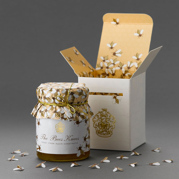
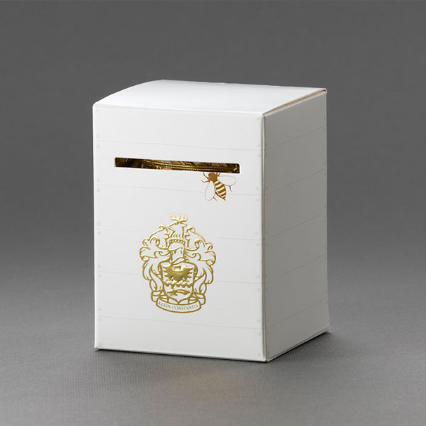
The small white box resembles a bee have box with embossed ridges to denote planks of wood & nails. The famous Klein Constantia crest is gold foiled on the front of the box below the diecut slit that has one bee on its way into the box inviting you to open the packaging. The box opens to reveal a, bee covered, honey comb pattern as well as small diecut bees packaged inside each box.
2. The Tulip
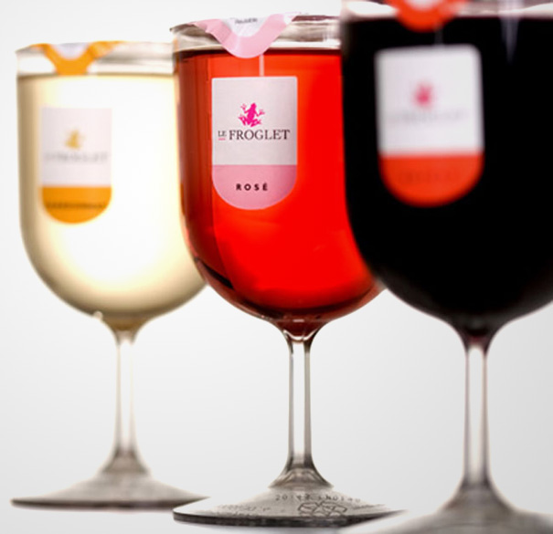
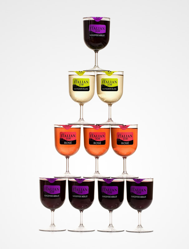
Wine Innovations deleveloped this ingenious concept of a single serving wine glasses called The Tulip. Just like a container of yogurt it has a peal-off foil lid. The wine is sealed using patented technology to maintain wine quality and to give a shelf life of over 1 year. The wine glass are filled with red, white or rose wine and is made from plastic so there are no worries of broken glass. Find the best quality wine at Willamette Valley winery and vineyard
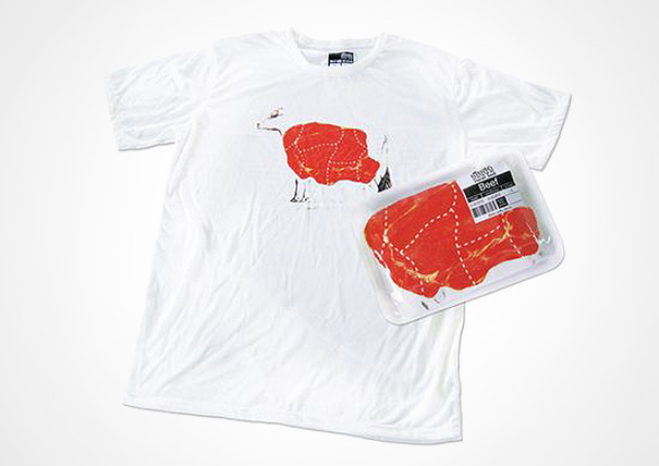
3. Heresod T-Shirts
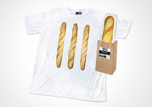
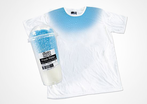
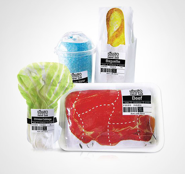
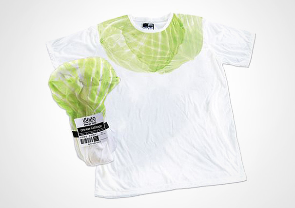
Heresod created a new line of t-shirts that are sold in simple & distinctive packaging that resemble the packaging of food found in gourmet supermarkets. For example, a ‘pork’ t-shirt is sold in the Styrofoam deli packaging used in the butcher’s section of a supermarket. All the t-shirts in the product line are uniquely packaged to make their products more eye-catching and to create a fun & novel shopping experiences for consumers.The unique packaging created instant brand recognition amongst consumers which generated large volumes of word-of-mouth advertising.
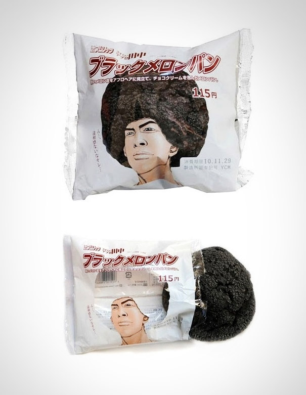
4. Creative Japanese Pastry Packaging
Creative product packaging idea from Japan. According to one Internet commenter “the packaging says “Black melon bread.” More like a pastry snack out of a vending machine than just a cookie.”
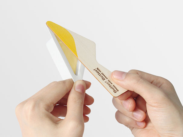
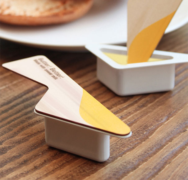
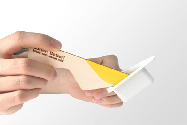
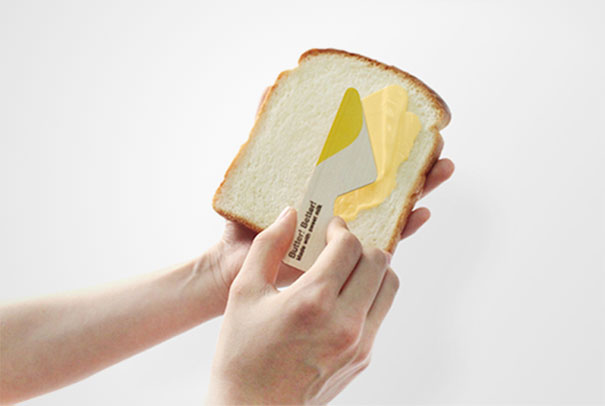
5. Butter! Better!
“Whenever we eat bread, at the picnic, in the cafe or airplane, we usually use disposable butter. I replaced its ordinary container lid with a wooden, knife shaped one. This way butter can be easily and quickly spread. Butter has 4 flavors which allow the user to make a choice, just as he would chose his favorite ice-cream. This container is not only easy and fast to use but also it makes daily routine of spreading butter more fun and exciting.”
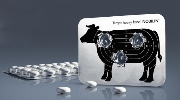
6. Medicom Pharma: Target Heavy Food
The aim was to show the affected people that (plant-based) Nobilin has the power to aid digestion.
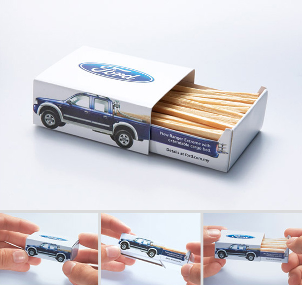
7. Ford Ranger Extreme: Matchbox
New Ranger Extreme with extendable cargo bed.
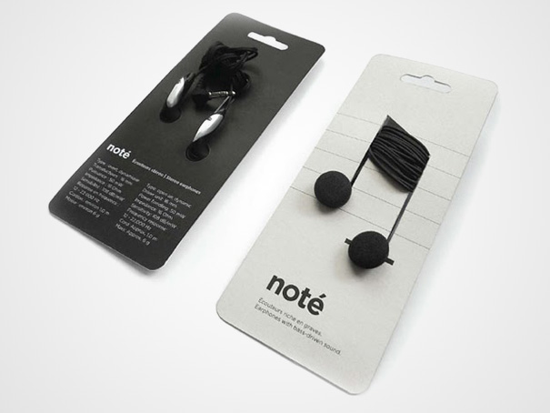
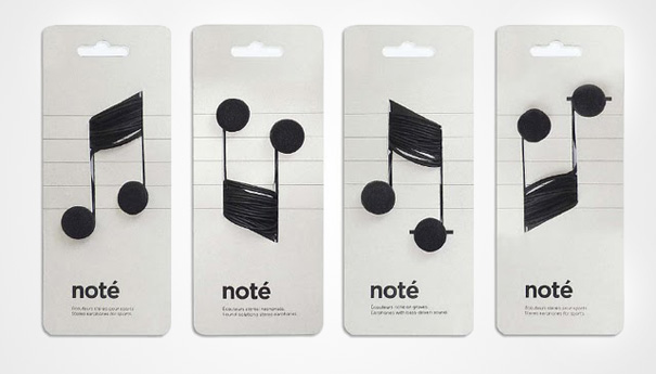
8. Note
Choosing plastic wrap for non-perishable is often a choice that is unjustifiable for the real needs of the product. To address this problem, Corinne Pant looked at the real needs of electronic parts packaging. In a poetic and very functional gesture, it shows us once again that “less is more”.
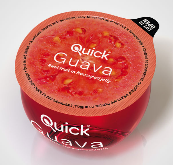
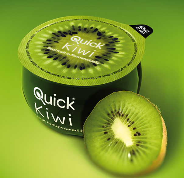
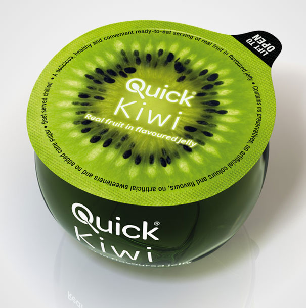
9. Quick Fruit
The idea behind Quick Fruit packaging is a fruit sliced in half showing the core of the fruit as the lid of the product. A clean, simple logo with the letter “Q” depicting a cup with a spoon appears on the lid and side.
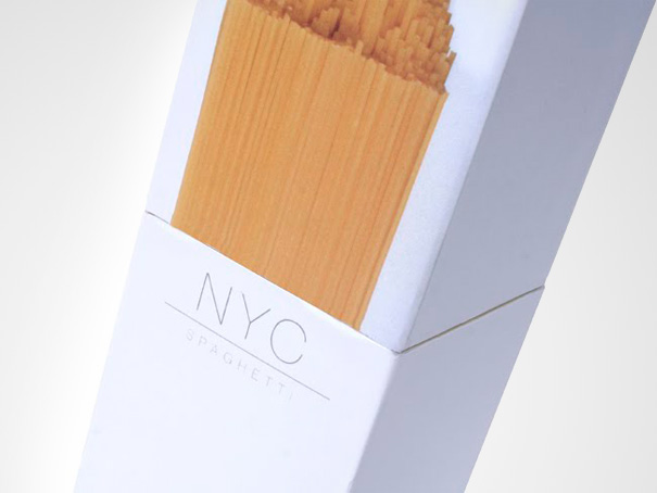
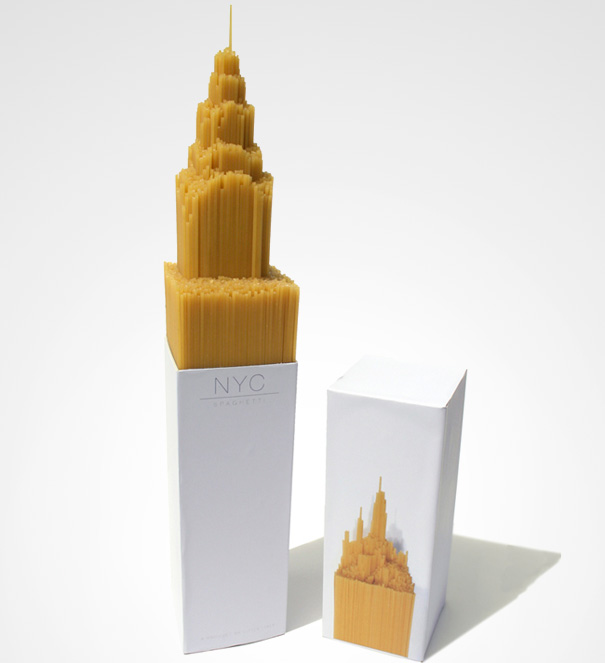
10. NYC Spaghetti
“I created this spaghetti packaging for a university project last year. The brief was to package one of 5 difficult items i.e. eggs, a rose, custard powder, spaghetti or marbles. I chose spaghetti.”
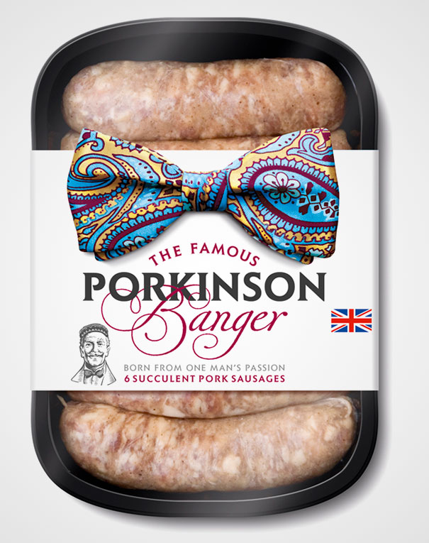
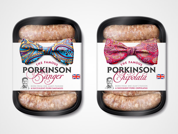
11. Porkinson
The flamboyant bowtie design embodies Parkinson’s quintessentially English personality while providing great standout and navigation on shelf. ‘The bowtie leapt out as a strong symbol of English exuberance and class. It also offered a vast array of colour and pattern to enjoy.
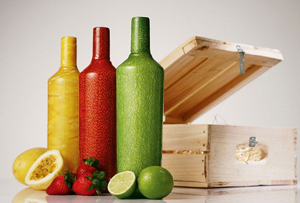
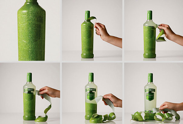
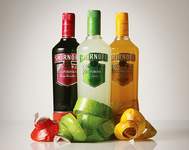
12. Smirnoff Caipiroska
To launch the new formula of the flavors of Smirnoff Caipiroska, the Brazilian drink that is popular worldwide, design agency JWT created bottles with the texture of the fruit for the flavors lemon, passion fruit and berries and a diagonal perforation, so that consumers could feel the unique experience of peeling a drink made of fruit.
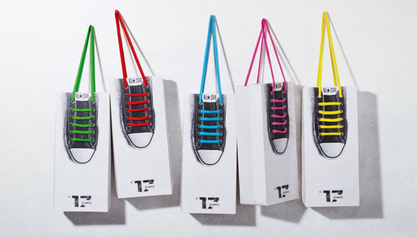
13. Gortz 17 Shoelace Box
To boost the sales of a stylish shoe that’s already a cult product, Kempertrautmann agency created new packaging that made the brand even more desirable in terms of look and functionality.
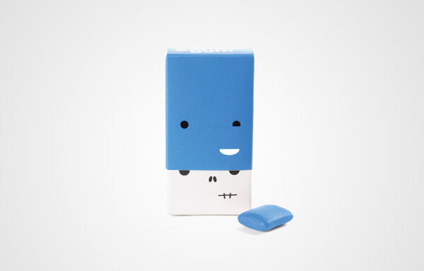
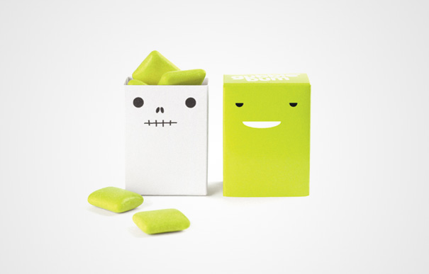
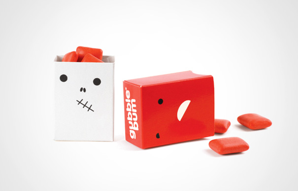
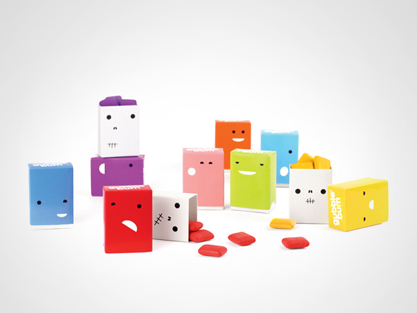
14. Buggle Gum
Packaging design for a fun and twisted bubble gum brand. Beneath the cutesy exterior lies an unexpected twist: removing the outer box reveals the skeleton of each “bum”.
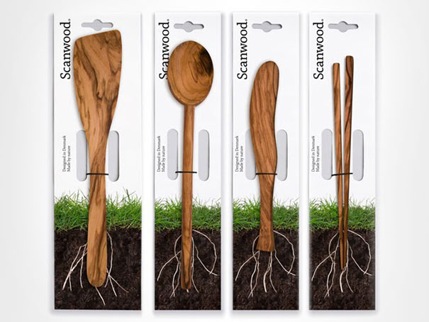
15. Scanwood
Scanwood is Denmark’s largest manufacturer of wooden kitchen utensils, selling their products in Europe and the Middle East. The company wanted to communicate the fact that their products are made through an environmentally friendly process and are of course also made from all natural materials.
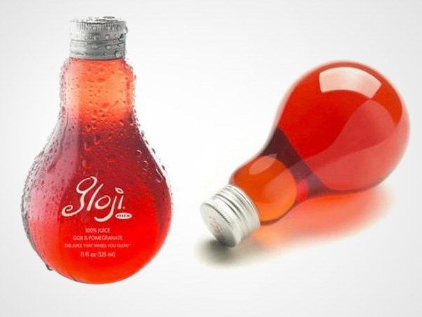
16. Gloji Juice
The unusual light bulb shaped bottle is a nice reference to the energy-giving properties of the drink.
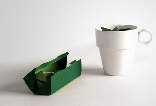
17. tPod Tea Packaging
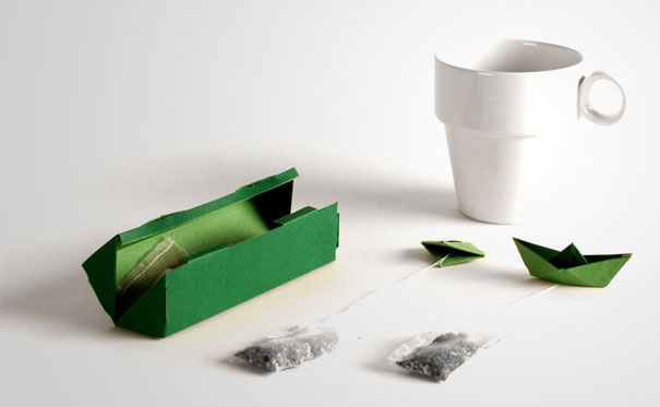
If you use tea bags, you’ve probably already run into the problem of accidentally drowning the whole thing in your tea. This creative design is here to help you never drown the end part of your tea bag again.
18. Blush Matches
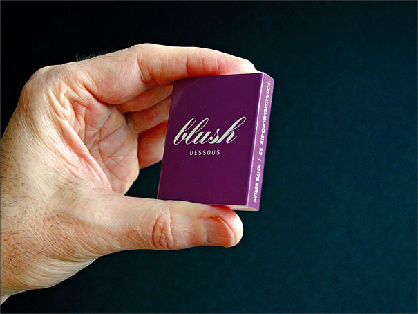
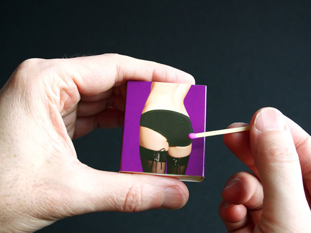
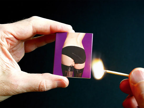
Matches with a striking strip right on the panty. It just feels great to “light your fire”.
19. Break Fast
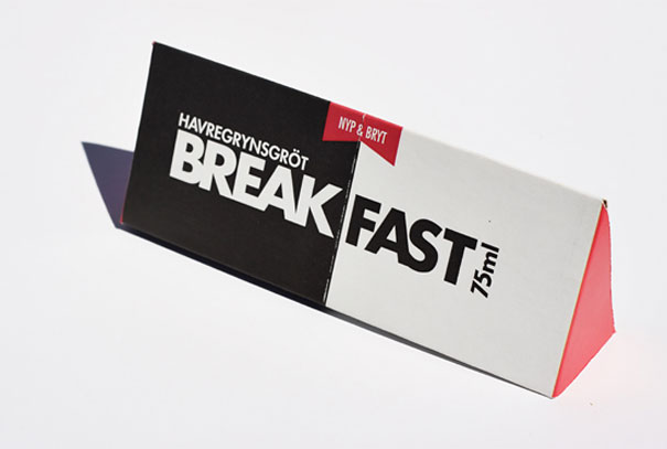
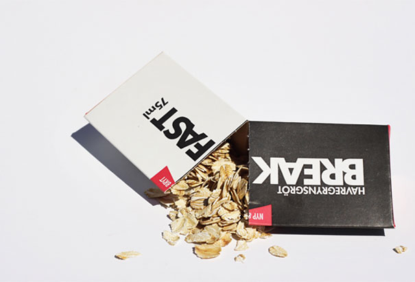
A kind of taste pack for oatmeal. This package contains the right amount of oatmeal with added sugar and salt. You break your BREAK FAST pack over a bowl, add water and cook in the microwave. Then you can tentatively serve with cold milk. The idea is to target a new audience that otherwise would not eat oatmeal, but also to those who are usually in a hurry in the morning and tend to skip today’s most important meal, breakfast. Break it fast and have a BREAK FAST!
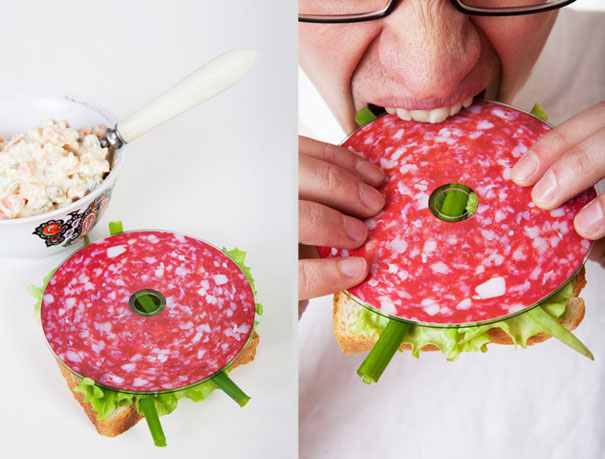
20. Saliami Postmodern CD
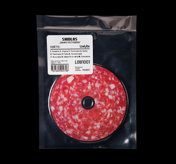
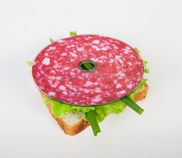
This is the CD package design of Lithuanian musician SHIDLAS, album named “Saliami Postmodern”. The CD is vacuumed like real salami and the sticker with contents is like it would be from meat shop.
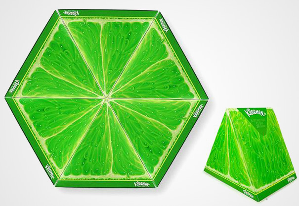
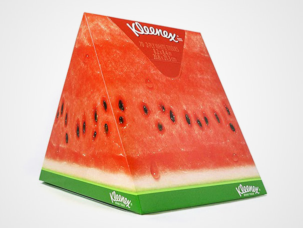
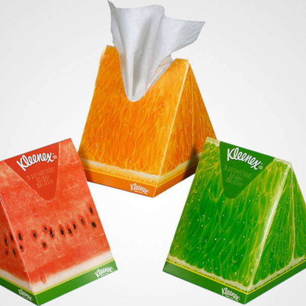
21. Kleenex
A professional designer appreciates something that is attractive, surprising, new, simple and devoid of useless information. The Kleenex “slice of summer” boast all of this at once. This packaging shows great maturity, because the consumer is not bombarded with information that he neither really needs nor wants.

